Quiz · Medium
Twenty-three questions on Gestalt principles, CRAP, Fitts's and Hick's laws, color models, type anatomy, readability, grids, responsive basics and accessibility.
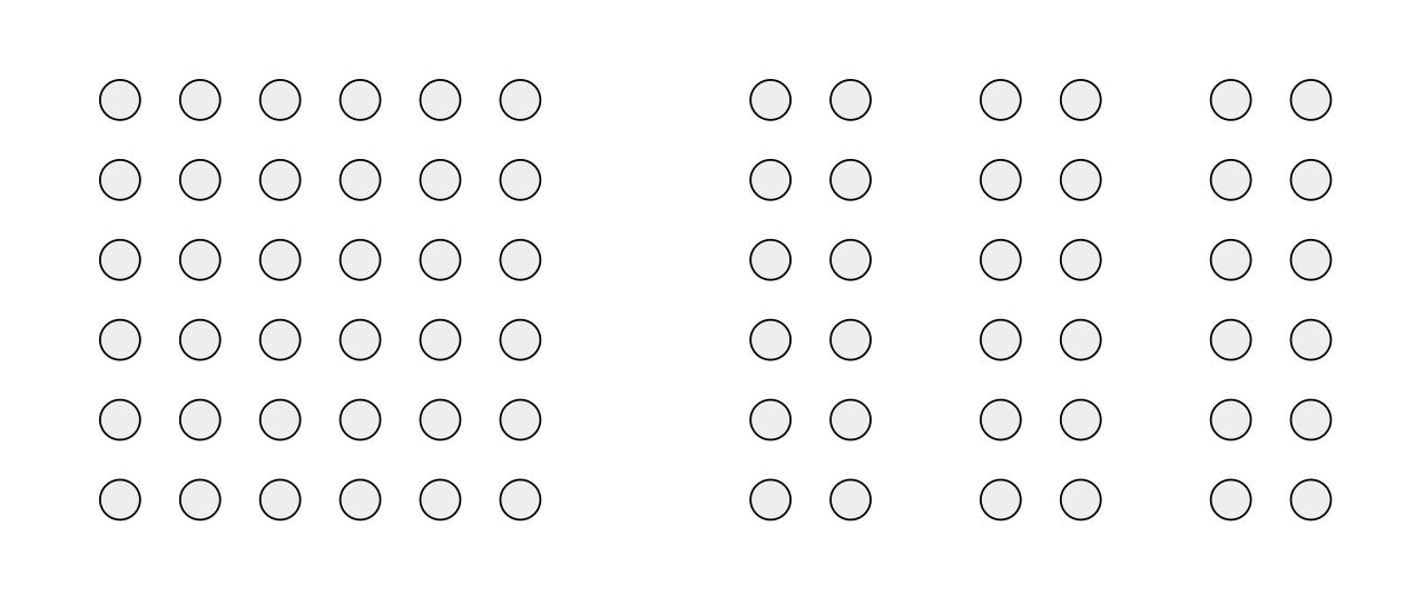
These dots are all the same size and shape. Which Gestalt principle makes the right-hand set look like three separate column groups?
Similarity
Closure
Proximity
Continuity
Elements that are close together are perceived as a group. The columns are grouped because the gaps between the groups are larger than the gaps within them. Similarity would require different colors or shapes.
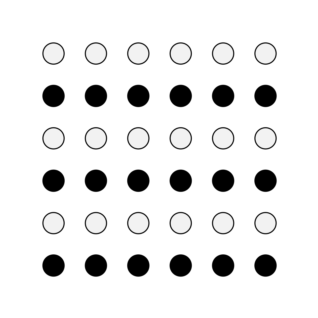
The dots in this picture are evenly spaced, yet they read as rows. Which principle explains it?
Similarity
Proximity
Figure-ground
Common region
Dots with the same color are perceived as belonging together, which creates horizontal stripes. The spacing is equal, so proximity cannot be the cause.
In the 60-30-10 color rule, what is the 10% for?
An accent color for calls to action and highlights
The background
Secondary surfaces
Body text
About 60% dominant color, 30% secondary and 10% accent. The accent draws attention to key actions.
A designer aligns every heading, paragraph and button to the same left edge. Which CRAP principle is this?
Contrast
Repetition
Proximity
Alignment
Alignment places elements on shared lines, which creates visual connections and order. Repetition would be using the same style for similar elements; proximity is about spacing related items together.
Which change most improves how quickly users can hit an important button on a phone, according to Fitts's law?
Making it a different color only
Making it larger and placing it within easy thumb reach
Moving it to a modal
Using a smaller font
Movement time depends on the distance to and the size of the target. Large, nearby targets are quickest. Color helps attention but does not change the physical effort of reaching it.
A site's main menu has 18 top-level items, and users are slow to find anything. Which law explains this, and what is the fix?
Fitts's law; make the items bigger
Hick's law; reduce and group the choices
Jakob's law; copy another site's logo
Miller's law; add more items
Hick's law: decision time grows with the number of options. Group related items, use a mega menu or progressive disclosure, and prioritize the top few.
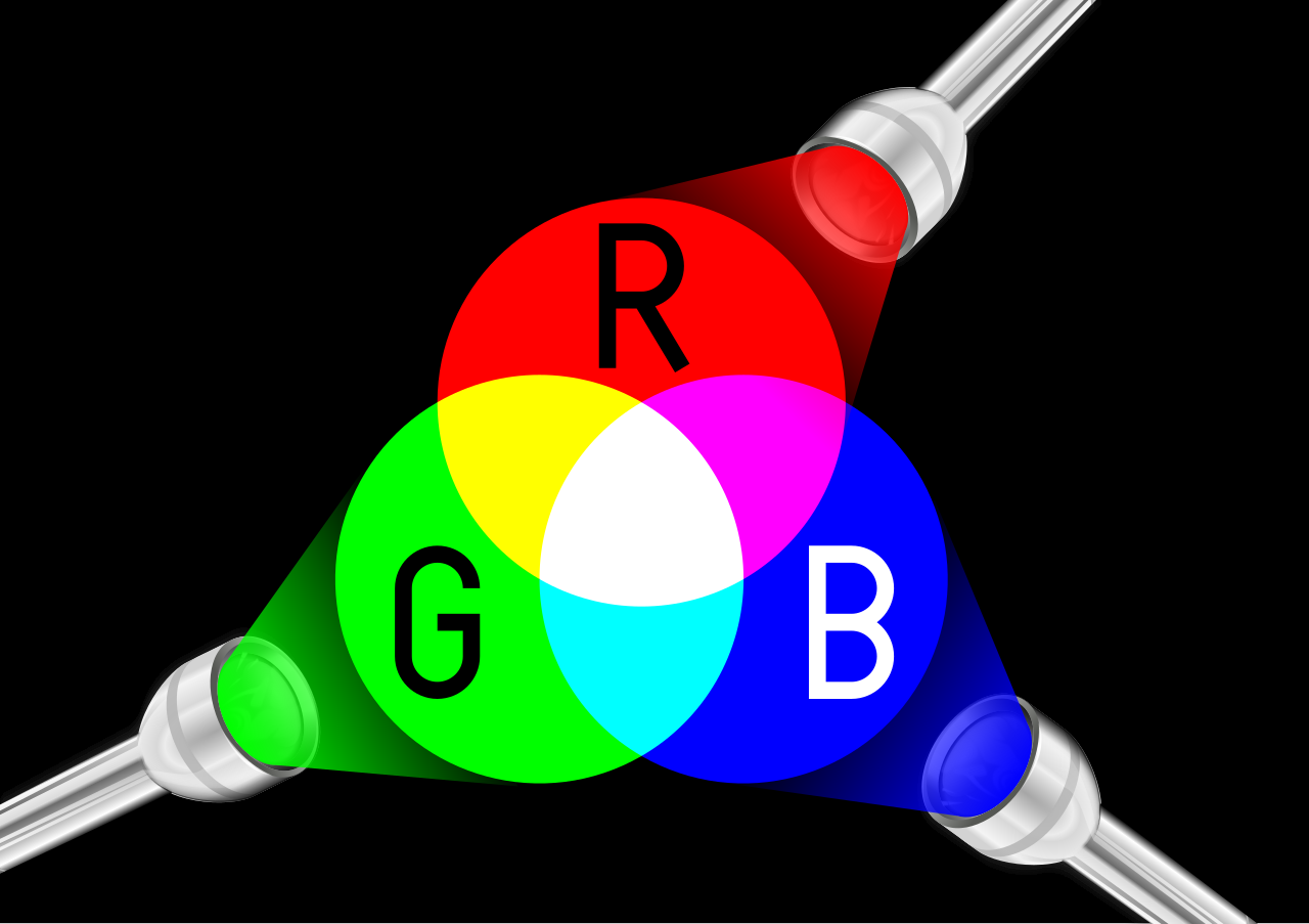
In this additive color diagram, what do you see where red, green and blue light all overlap?
Black
Gray
Brown
White
Additive mixing (screens) adds light, so full red + green + blue produces white. In subtractive mixing (inks) combining colors gets darker. Image: MikeRun, CC BY-SA 4.0, via Wikimedia Commons.
What color is #ffff00 on screen?
Yellow
Cyan
Magenta
Orange
Full red (ff) and full green (ff) with no blue (00) add up to yellow. Cyan is #00ffff and magenta is #ff00ff.
In HSL, which hue value is closest to pure blue?
0
120
240
300
The hue wheel puts red at 0, green at 120 and blue at 240 degrees. 300 is magenta.
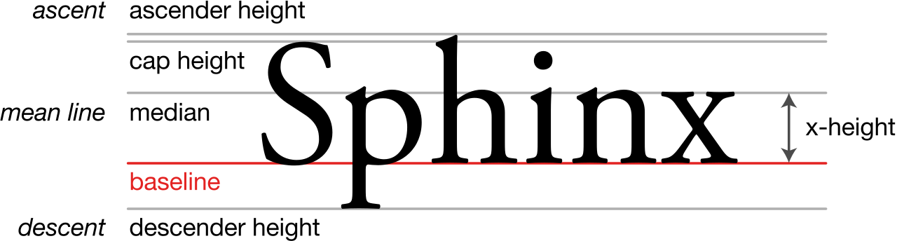
What is the name of the measurement that marks the height of lowercase letters such as x?
Cap height
Ascender height
Baseline
x-height
The x-height is the height of lowercase letters without ascenders or descenders. Cap height is for capital letters; ascender height belongs to letters such as h and d.
What is the main visual difference between the two letter pairs in this picture?
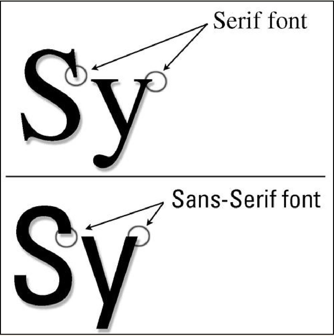
The top one is bold and the bottom one is italic
The top has serifs (small strokes at the stem ends); the bottom is sans-serif
The top is monospace
They are identical
Serif typefaces have small finishing strokes; sans-serif ('without') typefaces do not. The circles in the image mark the serif or the lack of it. Image: Jry Marie V. Reyes, CC BY-SA 4.0, via Wikimedia Commons.
What is a good line length for readable body text?
About 20 characters
About 120 characters
About 45 to 75 characters
Full screen width on a 27-inch monitor
Too-short lines break reading rhythm; too-long lines make it hard to find the start of the next line. Limit the width of text blocks, for example with max-width: 65ch.
Which of these gray text colors on a white background passes WCAG AA for large text (3:1) but fails for normal text (4.5:1)?
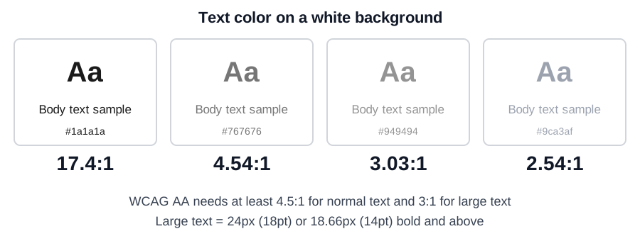
#949494 (3.03:1)
#1a1a1a (17.4:1)
#767676 (4.54:1)
#9ca3af (2.54:1)
#949494 has 3.03:1: enough for large text but not body text. #767676 passes both, #1a1a1a passes everything, and #9ca3af fails even the large-text threshold.
Which media query approach matches 'mobile-first' CSS?
Base styles for desktop, then @media (max-width: 767px) for phones
Separate sites for phones and desktops
Base styles for small screens, then @media (min-width: 768px) { ... } to enhance for larger ones
Fixed 1200px layout with zoom
Mobile-first starts with the simplest layout and adds complexity with min-width queries, so small devices load less CSS and content is prioritized.
What does <meta name="viewport" content="width=device-width, initial-scale=1"> accomplish?
It makes the site load faster
It makes mobile browsers use the real device width so responsive CSS works as designed
It disables zooming
It adds a mobile menu
Without it, many mobile browsers render a ~980px wide virtual page and shrink it, defeating media queries.
What is the recommended minimum size for touch targets in the WCAG 2.2 AAA criterion and in Apple's guidelines?
10 by 10 pixels
24 by 24 pixels
100 by 100 pixels
About 44 by 44 pixels
44 by 44 CSS pixels (44 pt in Apple's guidelines; Material suggests 48 dp) is the comfortable size. WCAG 2.2 AA sets the bare minimum at 24 by 24 CSS pixels.
An image on a page is purely decorative. What should its alt attribute be?
alt="image"
alt="decorative picture of a border"
alt="" (empty)
Omit alt entirely
An empty alt tells screen readers to skip the image. A missing alt attribute may cause assistive technology to read the file name instead.
Why is a real <button> better than <div onclick=...>?
Buttons are keyboard focusable, activate with Enter and Space and expose the right role to screen readers by default
Buttons load faster
Divs cannot have CSS
Buttons never need labels
Native elements bring accessibility behavior for free. A div needs tabindex, role and key handling to approximate it.
Which of these is a 'good' Core Web Vitals threshold for Largest Contentful Paint (LCP)?
5 seconds or less
10 seconds or less
200 milliseconds or less
2.5 seconds or less
Good LCP is 2.5 s or less. INP is good at 200 ms or less and CLS at 0.1 or less.
Which artifact is a static, high-fidelity picture of the final look, with real colors, type and imagery?
Wireframe
Mockup
Sitemap
User persona
A wireframe is a low-fidelity layout skeleton; a mockup shows the visual design; a prototype adds interactivity.
In this grid diagram, what are the pink strips between the blue columns called?
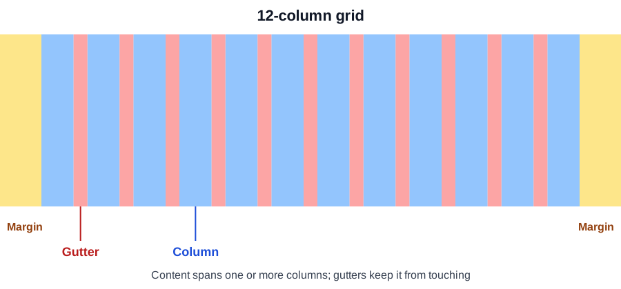
Margins
Gutters
Baselines
Gaps of the viewport
Gutters are the spaces between columns; margins are the outer areas on each side.
What is the main drawback of hiding the main navigation behind this icon on desktop?
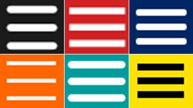
It is too large
It cannot be styled
It breaks HTML
It reduces discoverability: users must click to see the options
The hamburger icon saves space but conceals navigation, so people use hidden options less. On wide screens visible links are usually better.
True or false: using only a red border to mark an invalid form field is sufficient for accessibility.
True
False
False. Color alone fails users with color vision deficiencies (WCAG 1.4.1). Add an error message and an icon or text, and associate it with the field.
