Quiz · Medium
Twenty-four exam-style questions on semantic HTML, selectors, the box model, flexbox, grid, units and responsive design, with diagram questions.
Which element is the best choice for the main block of site navigation links?
<aside>
<div class="nav">
<nav>
<menu>
<nav> is the semantic landmark for major navigation blocks, and screen readers can jump to it. A <div class="nav"> has no meaning, <aside> is for tangential content, and <menu> is meant for a list of commands, not site navigation.
In this diagram, which layer sits directly between the content and the border?
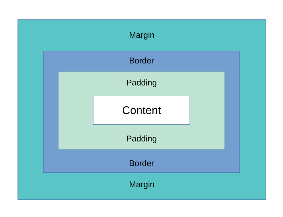
Gutter
Padding
Margin
Outline
Padding is the space between content and border, and the element's background shows through it. Margin is outside the border. Outline is drawn outside the border and is not part of the box model. A gutter is a grid or column gap, not a box layer.
An element has width: 300px; padding: 10px; border: 5px solid; and default box-sizing: content-box. How wide is the box on screen (excluding margin)?
320px
300px
330px
315px
With content-box, width is the content only: 300 + 10 + 10 + 5 + 5 = 330px. 300px would be the case under border-box; 315px and 320px each forget one of the two sides of padding or border.
The same element uses box-sizing: border-box. What is the width of its content area?
330px
300px
285px
270px
Under border-box, the 300px includes padding and border: content = 300 - (10 + 10) - (5 + 5) = 270px. 285px forgets one side's padding and border; 330px is the content-box total width.
Which image shows justify-content: space-between for a row flex container?
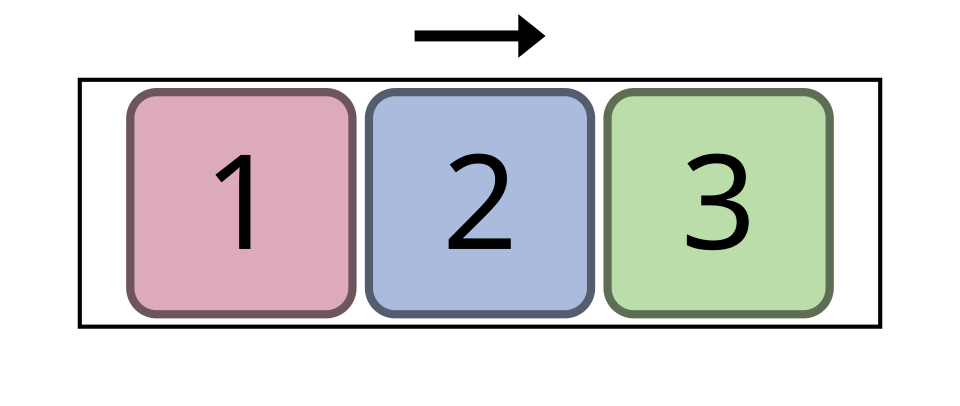
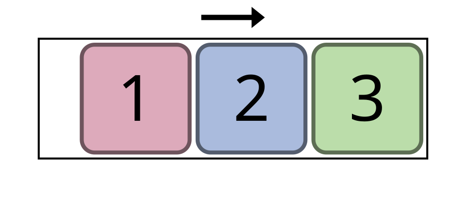
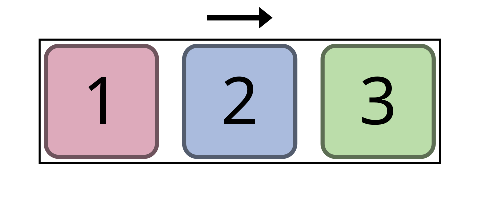
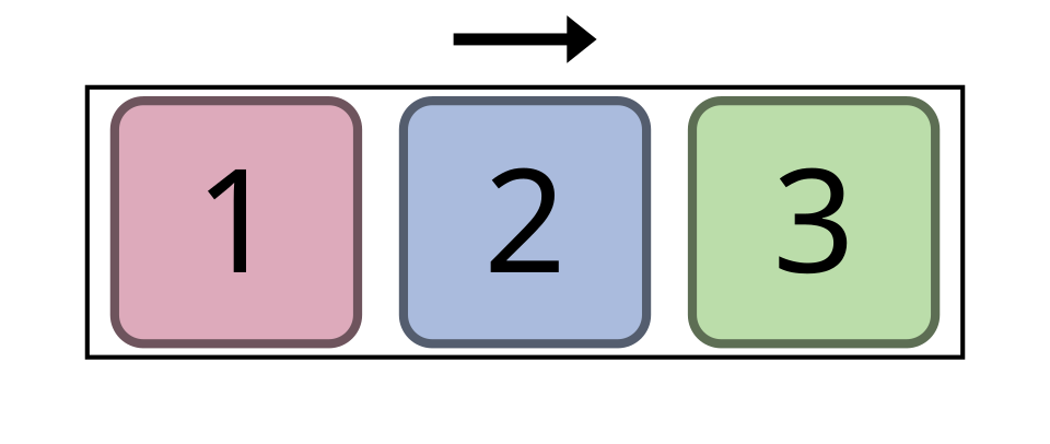
space-between puts the first item at the start and the last at the end with equal gaps between. space-around leaves half-size gaps at the edges, center groups items in the middle and flex-end packs them at the end.
Image: Hunsvotti, CC BY-SA 4.0, via Wikimedia Commons.
Which media query belongs to a mobile-first stylesheet?
@media screen and (width = phone) { ... }
@media (min-width: 768px) { ... }
@media (max-width: 768px) { ... }
@media (device: mobile) { ... }
Mobile-first means base styles target small screens and min-width queries add layout as the screen gets wider. max-width queries are the desktop-first approach. The other two are not valid media features.
html { font-size: 16px; }, a <div> with font-size: 1.5rem, and a <p> inside it with font-size: 1.5em. What is the <p> font size?
27px
36px
22.5px
24px
The div is 1.5 x 16 = 24px. em is relative to the parent's font size, so the p is 1.5 x 24 = 36px. 24px would be correct if the p used rem.
Which image shows justify-content: space-around?
With space-around, each item has equal space on both sides, so the gap at the container edges is half the gap between items. In the space-between image the first and last items touch the edges.
Image: Hunsvotti, CC BY-SA 4.0, via Wikimedia Commons.
Which selector matches only the direct <li> children of a <ul>?
ul > li
ul ~ li
ul + li
ul li
> is the child combinator. ul li also matches nested list items at any depth, ul + li would need an li that follows a ul as a sibling, and ul ~ li any later sibling li.
Which declaration vertically centers the children of a row-direction flex container?
vertical-align: middle
justify-content: center
text-align: center
align-items: center
In a row, the cross axis is vertical, controlled by align-items. justify-content works along the main (horizontal) axis. text-align only aligns inline content, and vertical-align does not apply to flex items.
.title { color: blue; } comes first in the stylesheet and p { color: red; } comes after. A <p class="title"> is shown in which color?
Red
Blue
The browser default
Purple (they mix)
A class selector (0,1,0) has higher specificity than a type selector (0,0,1), so the earlier .title rule wins. Source order only matters when specificity is equal. CSS never mixes conflicting values.
An absolutely positioned element is placed relative to what?
The viewport
The nearest ancestor that has a position other than static (or the initial containing block if none)
The previous sibling
Its parent element, always
position: absolute looks up the tree for the nearest positioned ancestor. A common bug is forgetting position: relative on the intended parent, so the element ends up positioned against the page. fixed is the one that uses the viewport.
In grid-template-columns: 1fr 2fr 1fr, how much of the free width does the middle column get?
One quarter
Two thirds
One third
Half (50%)
The fr values add up to 4, and the middle gets 2 of them, so 2/4 = 50% of the free space (after gaps and fixed tracks). One third would be 1fr 1fr 1fr.
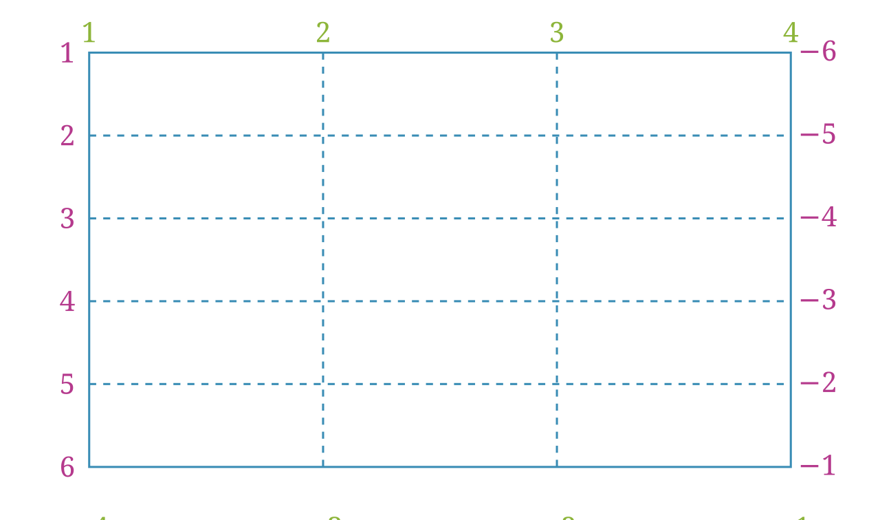
How many column lines does this 3-column grid have?
2
3
4
6
N column tracks are bounded by N + 1 lines, so 3 columns have 4 column lines numbered 1 to 4 (and -4 to -1 from the end). The 6 in the picture refers to row lines of the 5 rows.
Image: Hunsvotti, CC BY-SA 4.0, via Wikimedia Commons.
What does grid-template-columns: repeat(auto-fit, minmax(200px, 1fr)) give you?
Exactly 200px wide columns
Always three columns
As many columns as fit, each at least 200px wide, sharing leftover space
A single column on every screen
auto-fit creates as many tracks as fit the width, minmax(200px, 1fr) lets each track grow to share leftover space. It makes a responsive card grid without media queries.
Which <script> attribute downloads in parallel and runs after parsing finishes, keeping document order?
async
lazy
defer
preload
defer waits until HTML parsing finishes and runs deferred scripts in order. async runs as soon as the file arrives, in any order. lazy is not a script attribute, and preload is a <link rel> hint.
True or False: a placeholder attribute is an acceptable replacement for a <label>.
False
True
Placeholders vanish while typing, often have poor contrast, and are not a reliable accessible name. Use a visible <label> (and a placeholder only for an example value).
What should the alt attribute be for a purely decorative image?
The file name
Leave the attribute out entirely
An empty string: alt=""
The word "image"
Empty alt tells screen readers to skip the image. A file name or "image" is noise, and leaving out alt lets some readers read the file URL.
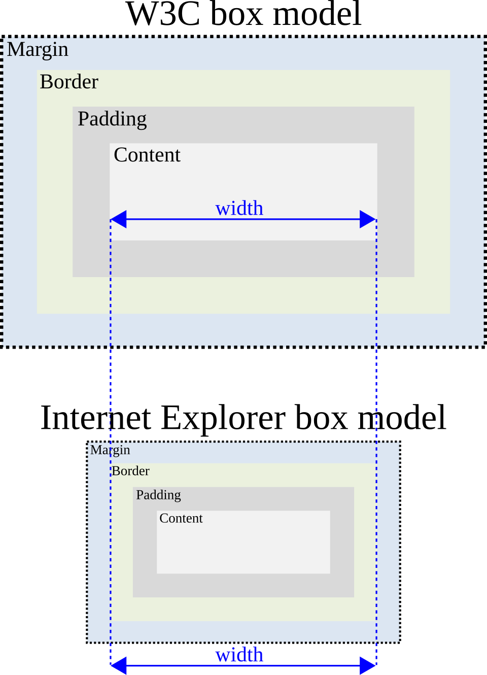
The lower diagram shows the old Internet Explorer box model. Which box-sizing value makes modern browsers behave like it?
border-box
margin-box
content-box
padding-box
In the IE model, width covers content + padding + border, which is exactly box-sizing: border-box. content-box is the W3C default shown in the top diagram. padding-box and margin-box are not valid box-sizing values.
Image: Warren and Will Pittenger, public domain, via Wikimedia Commons.
A block has margin-bottom: 20px and the next block has margin-top: 30px. What is the space between them?
10px
30px
50px
20px
Adjacent vertical margins collapse to the larger of the two (not the sum). It would be 50px in a flex or grid container, where margins do not collapse.
How do you make three radio buttons mutually exclusive?
Give them the same id
Give them the same name attribute
Wrap them in a <div>
Give each one required
Radios with the same name form a group, and only one can be checked. id values must be unique, a div has no effect on grouping, and required only demands a selection.
In a table of items, tr:nth-child(odd) styles which rows?
Only the first row
The 1st, 3rd, 5th... rows
Rows with an odd number of cells
The 2nd, 4th, 6th... rows
odd is the same as 2n+1, counting from 1. even would match rows 2, 4, 6.
You set z-index: 5 on an element but it has no effect. What is the most likely reason?
It is position: static (z-index only applies to positioned elements and flex/grid items)
z-index needs a value above 100
z-index works only inside media queries
z-index only works on images
A static element ignores z-index. Add position: relative (or make it a flex or grid item). The value itself does not need to be large, and it works for any element type.
What does the <meta name="viewport" content="width=device-width, initial-scale=1"> tag do?
Loads the mobile version of the site from the server
Makes the page layout width match the device width so responsive CSS works on phones
Makes the page zoom in automatically
Disables printing
Without it, mobile browsers lay the page out at a wide virtual width (about 980px) and scale down, so media queries and fluid layouts behave like on a desktop. It does not zoom, block printing or fetch another URL.
